|
Portraits of Inspiration:
Initial Sketches
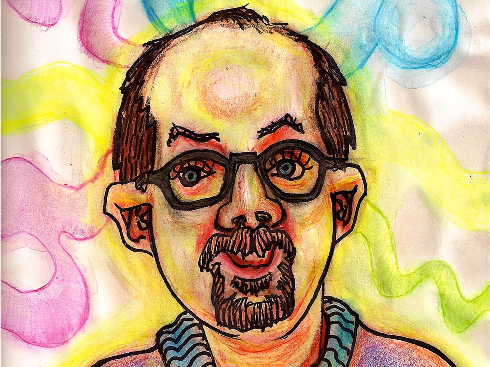
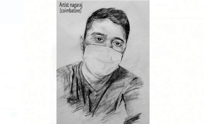
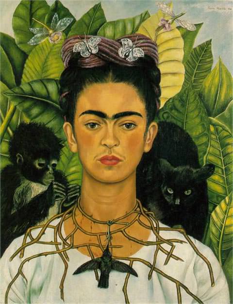
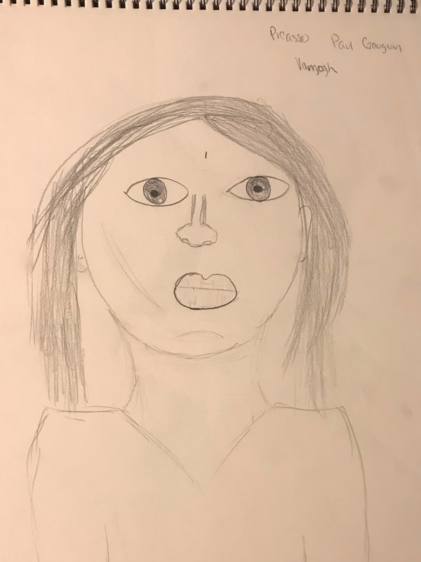
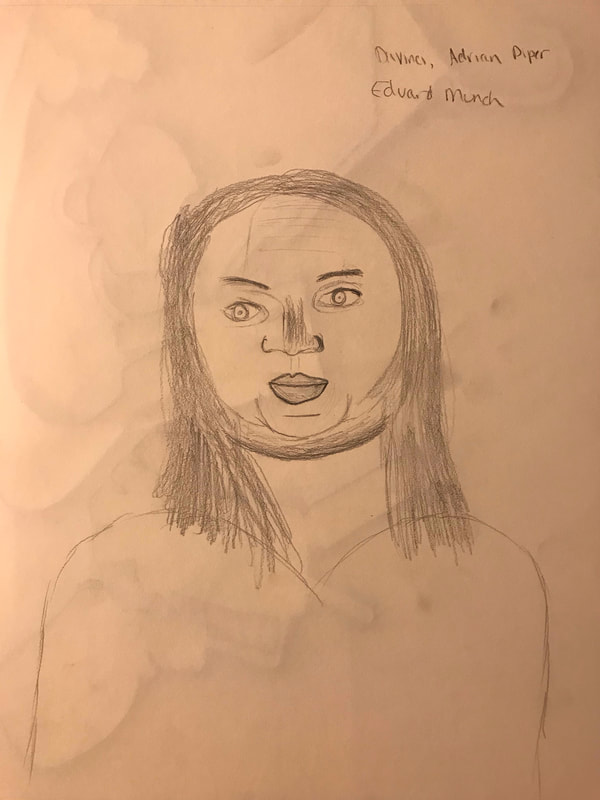
In working on this project, I looked at two different types of portraits to begin with. First, I looked at realistic versus abstract, noting the focus on facial features in self portraits from DaVinci, Adrian Piper, and Edvard Munch in the realistic. With the abstract images, my vision was pulled towards Picasso, Paul Gauguin, and Van Gogh. In particular with the abstract images, I was taken by the exaggerated features that didn't draw as closely to perfection on the shape of a nose or angle of a cheek. However, when I dove deeper into this project, I did a basic google search on artist self-portraits, which is where I came across Bryan Lewis Saunders', S Nagaraj's, and Frida Kahlo's portaits. Bryan's initially pulled me in due to what I was imagining in my head for the background of my image while Frida's pulled me in from how realistic her expression appeared and how she truly filled the entire image with something that feels almost exactly like a photograph. Still, it was S. Nagaraj’s self portrait that took me most. From the contour lining to the shading, it was the work I felt the urge to emulate the most, though that may be based in the fact that it was a black and white image. In terms of approaching my own self portrait, I considered several things. Portrait versus landscape was a big decision, especially given that I knew I wanted to put things in the background. Furthermore, as I feel I have a solid grasp on the grid technique, I knew I would tackle the picture from that vantage point. In terms of posing, I didn’t really give much consideration as I referred back to the most recent photo I’d had taken. That said, when I finally sat down to begin sketching, I decided on a landscape view, as it allowed me to include more in the image. In working, I put the general shape first to each facial feature before working in contour lines around the eyes and nose. Shading was also something I tried to reflect to as much of an exactness as possible on face in terms of reference to the photo. Having access to the variety of pencils really aided this part of the process. Upon finishing the general face and hair, I struggled initially with the background. Thought bubbles were always the plan, or some version of including a notation towards love of writing and/or reading. I initially looked at the idea of placing a typerwriter in the background and in fact printed off several images with the intention to grid them. However, when I began to attempt that process, I found myself extremely unsatisfied with the prospect of what I’d end up with and decided to go back. In taking some time to consider what to do instead, I reassessed and shifted my focus to books, and once I began sketching the initial spine of Paper Towns, the idea started to fill out in my head. The books themselves actually aided my process in terms of shape, being able to stack and visualize them and get a better idea of what they should look like. Given that the background took a lot of focus towards basic line and shading, I really focused on using the variety of pencils as well as the graphite stick to give depth to the different books. By far the most complicated version of this was on Go Set A Watchman, which included some illustration on the spine. That all said, upon finishing the assignment I definitely came away with ideas of how I would give approach to other things on a second go-around. I’d give more focus to background as well as shadow shading, continue to work to get a better understanding of drawing skin tone and hair with graphite, and consider working with an image with a better view of my shoulders. Even so, I’d consider this a good start to the self portrait. Final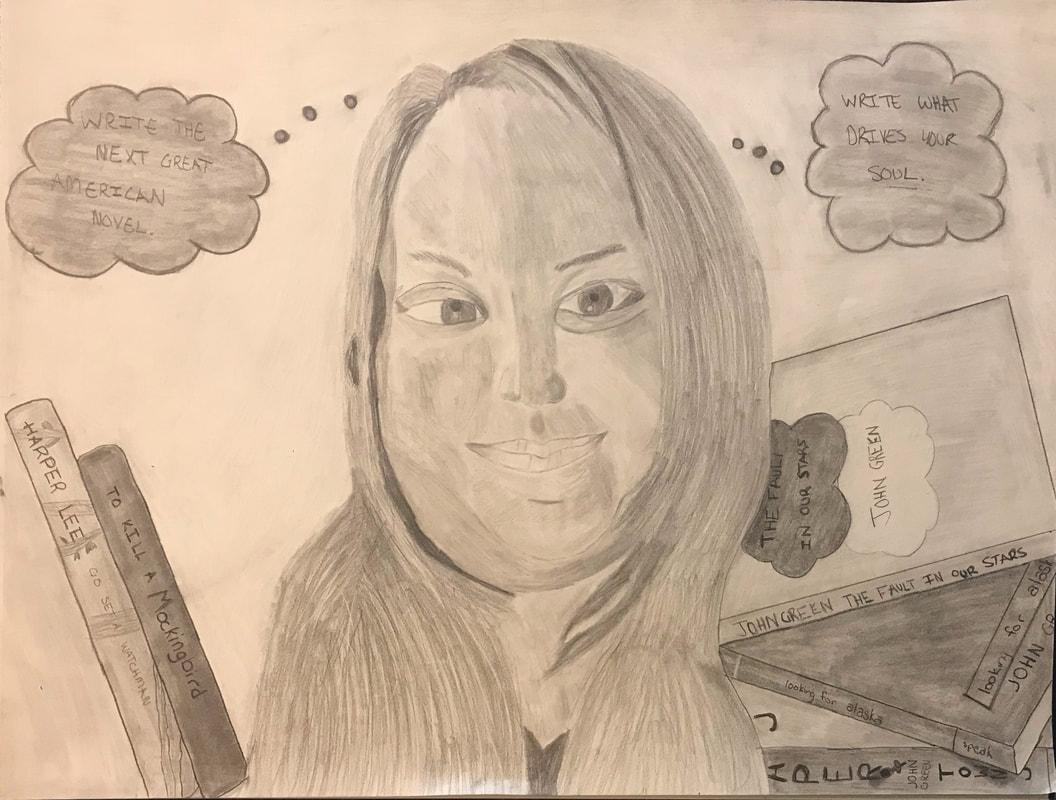
0 Comments
Leave a Reply. |
AuthorWrite something about yourself. No need to be fancy, just an overview. Archives
April 2021
Categories |
 RSS Feed
